
BolderBOULDER in Boulder (Colorado) belongs to the top 20 of the biggest road running races in the world. On Monday, 28 May, it celebrated its 40th anniversary. Let’s have a look at the statistics!
The event is not only known for its high number of participants, but also for its ceremonial aspects. The race takes place on memorial day, which a federal holiday in the USA to remember the people who died while serving the country’s armed forces. The event is very much associated with memorial day, as, for example, active military members are offered discounts on participation fees. Have a look at this video, in order to see how important the relationship between the race and memorial day is. A reason why this race is especially interesting for us is the fact that Frank Shorter, who is our ambassador, is co-founder and organiser of this 10km-long race. He is a long-time resident of Boulder and a life-size bronze statue of Shorter stands outside the stadium.
Now, let us turn to some facts about this years race. About 38’000 people finished the competition. While there is also a separate race for the elite runners, we would like to focus our analysis on the performances of the runners in the regular classes.
1) Nailing the 1 hour bench-mark
A first interesting point is the distribution of the 38’000 participants in terms of their running time. Graph 1 illustrates this:
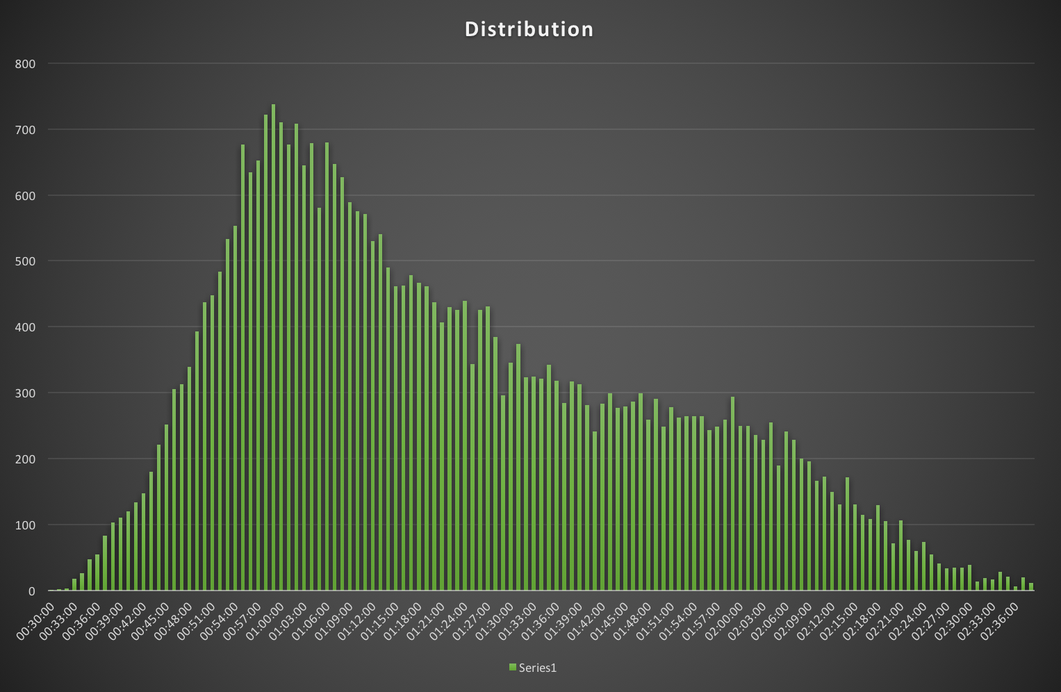
Graph 1: Distribution of runners on running time
As you can see, the peak of the distribution is at 1:00:00. More than 700 runners completed the race in around one hour, while most runners had times above that. The number uf running times below one hour decrease strongly with decreasing time. Towards the other side of the spectrum, we see that the amount of occurrences per time drops rather fast at the beginning, while the distribution seems a little bit more even for the times between 1:30:00 and 2:00:00. A possible explanation for this pattern is the fact that the times of 60, 90 and 120 minutes all are some kind of bench-marks to which people try to orient and which they try aim for or to underbid.
2) 31-year old men and 36-year old women are the fastest!
Let us now look a bit more closely at the sociodemographic correlations with running times. First, we’ll look at the fastest time ran by members of each age class and gender. This is shown in graph 2.
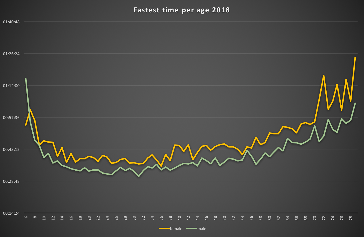
Graph 2: Fastest time run by member of each age class and gender 2018
What we can see here is that, not unexpectedly, males generally had lower times than females. While the fastest 6-year-old girl was faster than the fastest 6-year-old boy, the fastest times for males were always faster than the fastest times for females. The smallest difference between the genders can be seen for the 36-year-olds, the 43-year-olds, the 54-55-year-olds, and the 70-year-olds. In general, performances improve rather fast in younger years, while they remain constant within a wide range of age groups, getting worse only after about 45 years of age. The best performances were delivered by 31-year olds for men and 36-year olds for females.
3) Slower as from the age of 45?
Also when looking at the average times of all members of each age group depending on gender, we see that the average performances of males are lower than the ones of females. Thee difference seems to be the smallest for the ages of 6 to 14 years, 26 to 28 and 76. Also this graph reflects the result above, that performances increase fast with increasing age at the beginning, while there are only small differences between the times of 20-year-olds and 45-year-olds. After that, times start to increase again. Also average times were the lowest for males around 30 and females around 35.
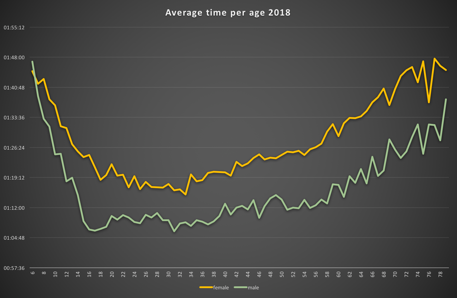
Graph 3: Average time per age group and gender 2018
4) Respect for the Alabama runners!
Another interesting fact to look at is the comparison of average times in this year’s race across the different states of the USA. The table below shows the average time for each state.
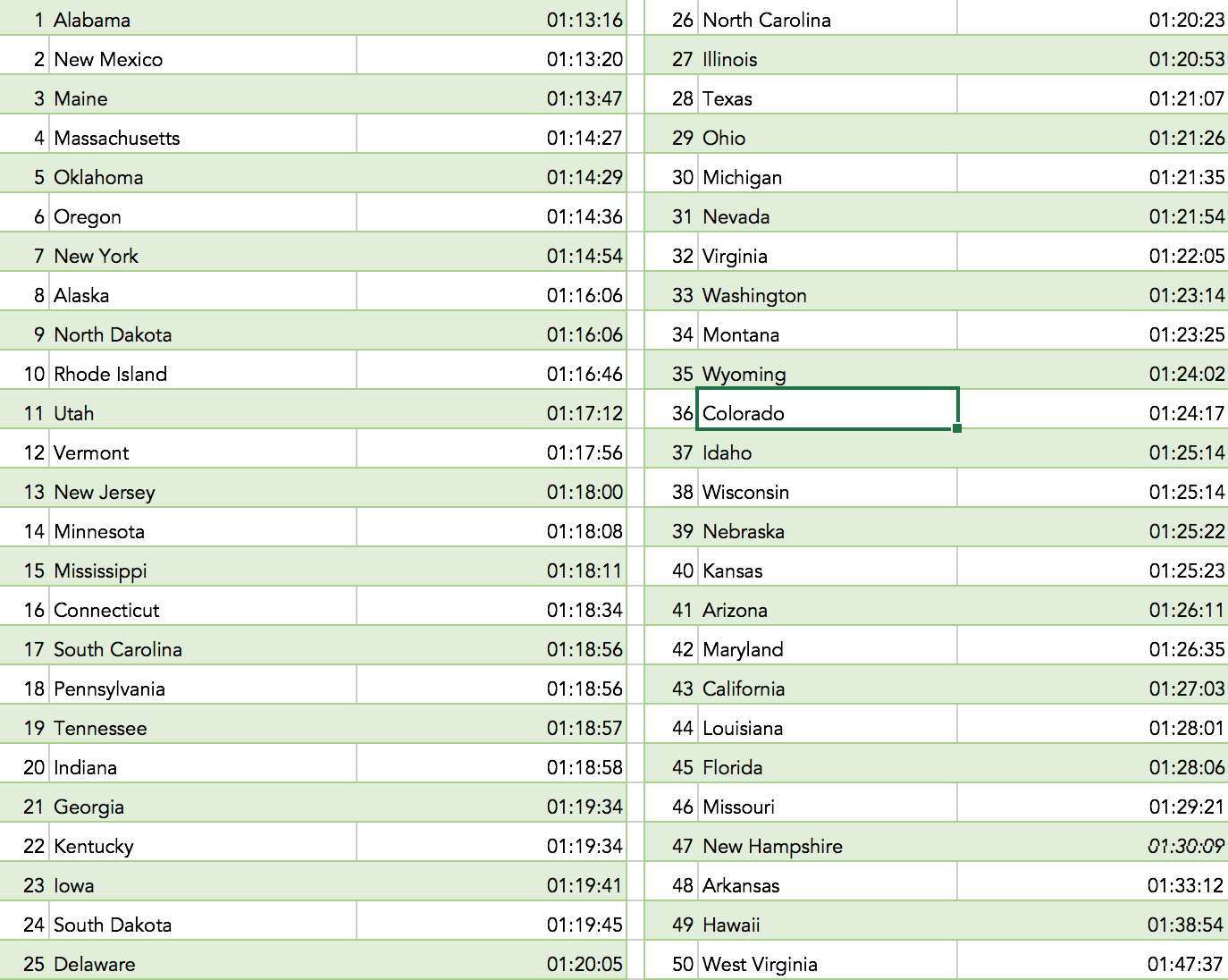
Table 1: Average time in 2018 for each state in the USA
The fastest average time was achieved by runners of Alabama with 1:13:16, followed by New Mexico and Maine. Somewhat surprisingly, the host state of the competition, Colorado, only scored the 36th best average time. However, the best time ever by a runner of a US American state was achieved by a Colorado runner (which we cannot see in this table, however).
5) Ladies chasing the men in the 70ties
Now, apart from the numbers of this years race, we are also interested in the comparison across genders and age groups over the years, as well as the development in performances.
Let us start with the best time ever run by members of each age and gender (since the first competition 40 years ago). This is shown in graph 4. We see a similar pattern as we did for the comparsison of times across age and gender for 2018, except from the fact that at some point in the history of the race, there were both a very fast 58-year-old and a very fast 68-year-old female. Also, the best times ever run by 73- and 75-year-olds were run by females, not men.
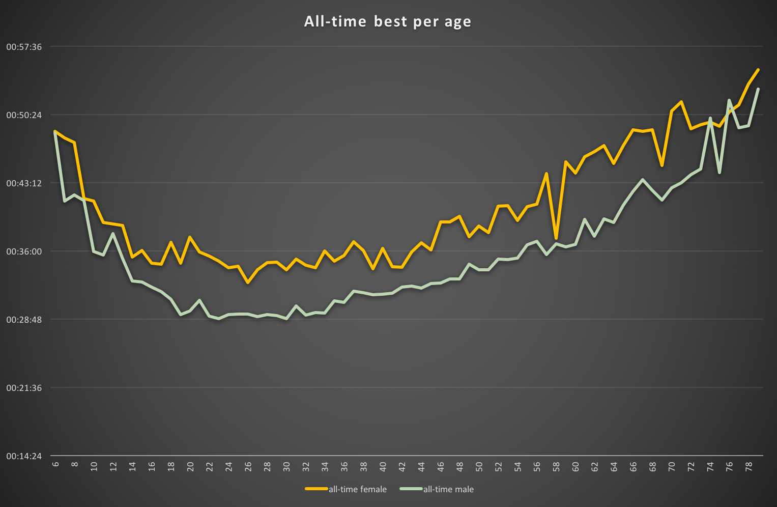
Graph 4: Best times ever run by members of each age group and gender
6) Numbers of records was increasing – is this about to change?
But what can we say about the level of performances across the years? Do people tend to run new records or are the numbers of new records stagnating? The following graph shows the amount of runners per year who ran a time among the best 20 times ever run by runners their age.
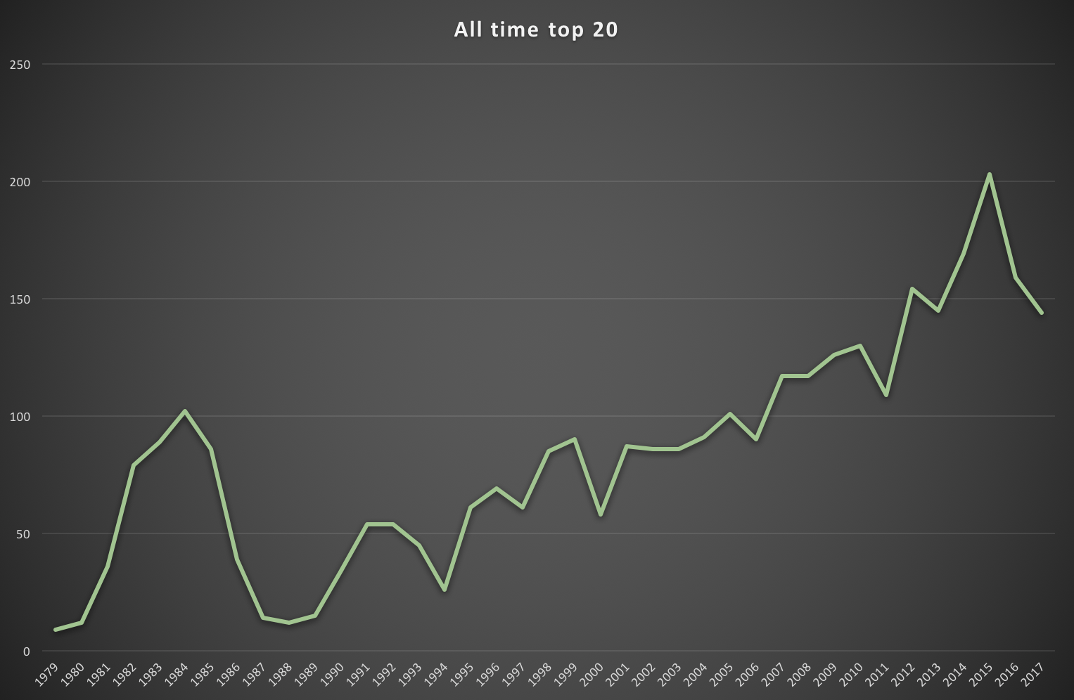
Graph 5: Amount of runners per year with a time among the all-time top 20 in their age group
The graph shows that a first peak with new records (over 100 cases) was reached in 1984, while it took 20 years until this number was reached again. After 2006, the numbers of new records for different age classes was always higher than 100, the highest ever number of new records being registered in 2015. The number of new records has thus been growing during the last 20 years overall. This year, however, during the last couple of days, we can observe a decrease. Of course, these results can be interpreted in different ways. The higher amounts of records might, for example, be explained by higher amounts of participants. However, in order to determine this, we would need to conduct a more in-depth data analysis.
7) People are faster than we thought…
Now, we also had a couple of running.COACH users running the competition! We are, of course, interested in the degree to which our prognoses for those users’ running times turned out to be accurate.
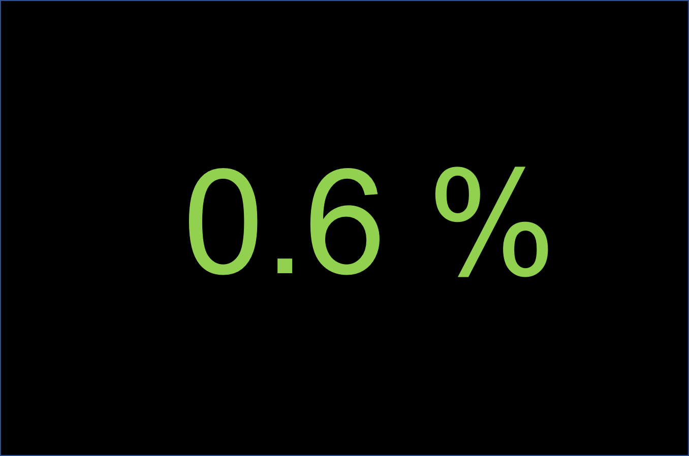
According to our calculations, our users were, in average, 0.6% faster than what we had said in our prognoses.
This blog entry was written by: Marion Aebi